Radiolab
As Radiolab enters its 20th year, one of audio’s most loved products came to us to build a brand strategy, identity and digital experience reflective of Radiolab today. The former radiolab.org was created to be a representation of a single podcast in WNYC’s portfolio, but in the intervening years, Radiolab grew into one of the world’s largest podcasts, reaching an audience of 1.6M weekly listeners.
The liminal space
We teamed up with our friends at Territorial to create a brand strategy that could be communicated internally across teams, and then effectively messaged externally to Radiolab’s devoted audience and dedicated partners. We defined Radiolab’s proposition, behaviors, and messaging, realizing that for its listeners, Radiolab reveals the limitless potential of a more mutable and inclusive world — a world where new answers are emerging and transforming before our eyes. As it explores the edge of understanding, it also pushes it farther out. Radiolab rewrites what we know, and what we think we know.

The freq, c’est chic
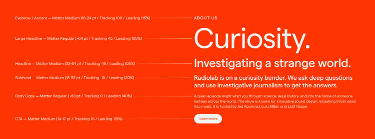
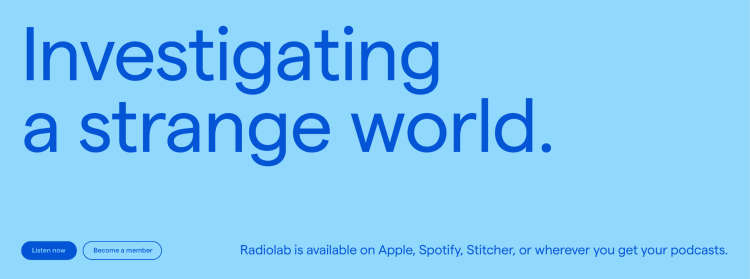
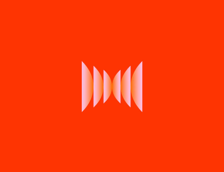
This spirit of Radiolab is captured in the new logo that we lovingly named ‘The Freq’. This mark can serve as a standalone visual element, or can be paired with the wordmark, photography, or content to create an infinite supply of compelling branded assets. We designed a new typographic, photography, and motion system, alongside a new color palette to give Radiolab as much flexibility as possible to express its newly defined strategy.

A digital world for an audio experience
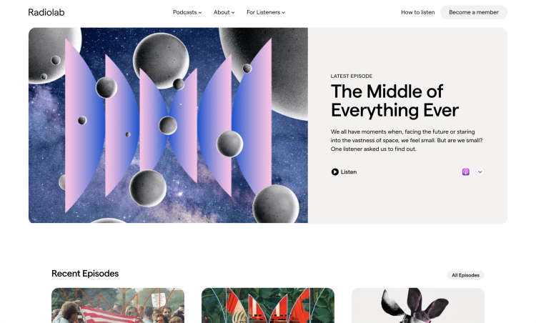
Our next goal was to bring this work to life in the new Radiolab.org site, its first standalone experience outside of WNYC’s digital architecture.

We wanted the site to be straightforward, unfussy, and above all content-focused, with a particular emphasis on navigating Radiolab’s huge episode archive and its growing paid membership base.