Ogilvy
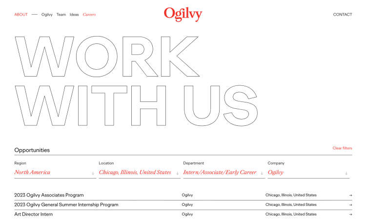
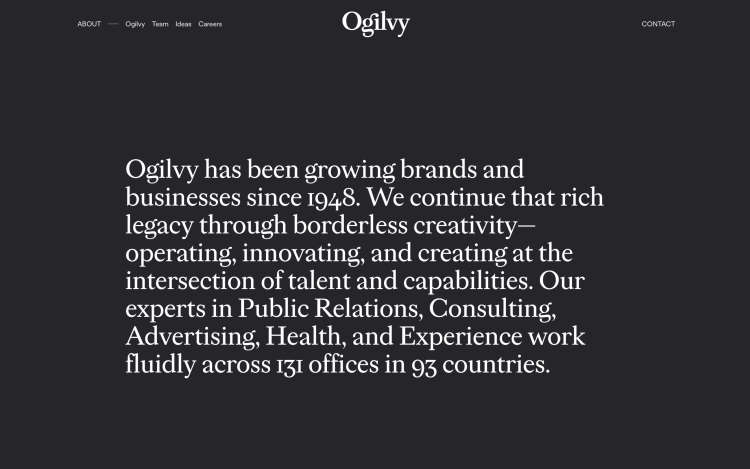
Ogilvy’s new corporate and brand strategy, done in partnership with our friends at COLLINS, was transformational, ambitious, and certainly no small feat: One Ogilvy. Over the decades, Ogilvy’s success and growth led to the creation of dozens of business units, each with their own brands, sites, and ways of working. Its new strategy would unite them as one, with the Ogilvy.com website acting as the bold new entry point for all.
Make the strategy real
Our metric for success for such a seismic business shift was clear — make the One Ogilvy strategy real. There were fundamental directives that the website needed to drive, including communicating Ogilvy’s differentiated POV, grounding the brand narrative in client needs and value, and shifting the brand from nostalgic to forward thinking.
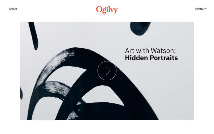
Information Achitecture
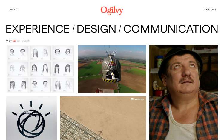
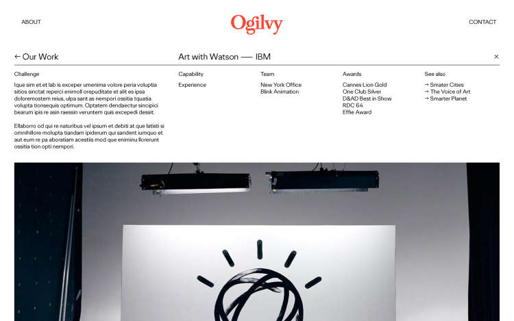
We organized content into 3 central themes that were each rooted in what clients want to know: how Ogilvy makes brands matter, how they add client value, and who Ogilvy are. Our identified key personas (decision-makers, decision-influencers, and employees) allowed us to stress-test this architecture and content strategy to make sure the design consistently drove each KPI.
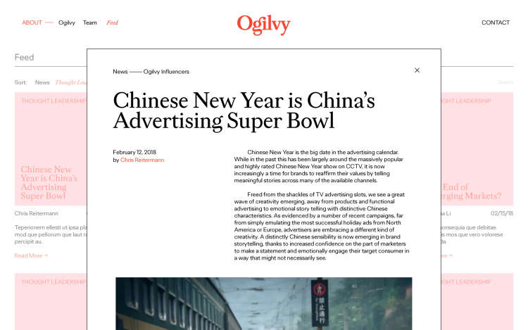
New Ogilvy, New Clients
With an intentional emphasis on Ogilvy’s creative strength, especially against new entrant competitors, the composition of Ogilvy’s client roster after its new site launch started to dramatically transform. It saw a new generation of clients that were tech-forward and disruptive — clients that would have historically searched elsewhere now understood the powerful creativity that Ogilvy housed. Ogilvy’s new chapter had begun.
